Increased sale by 3x for recruitment SaaS product
IranTalent
Overview
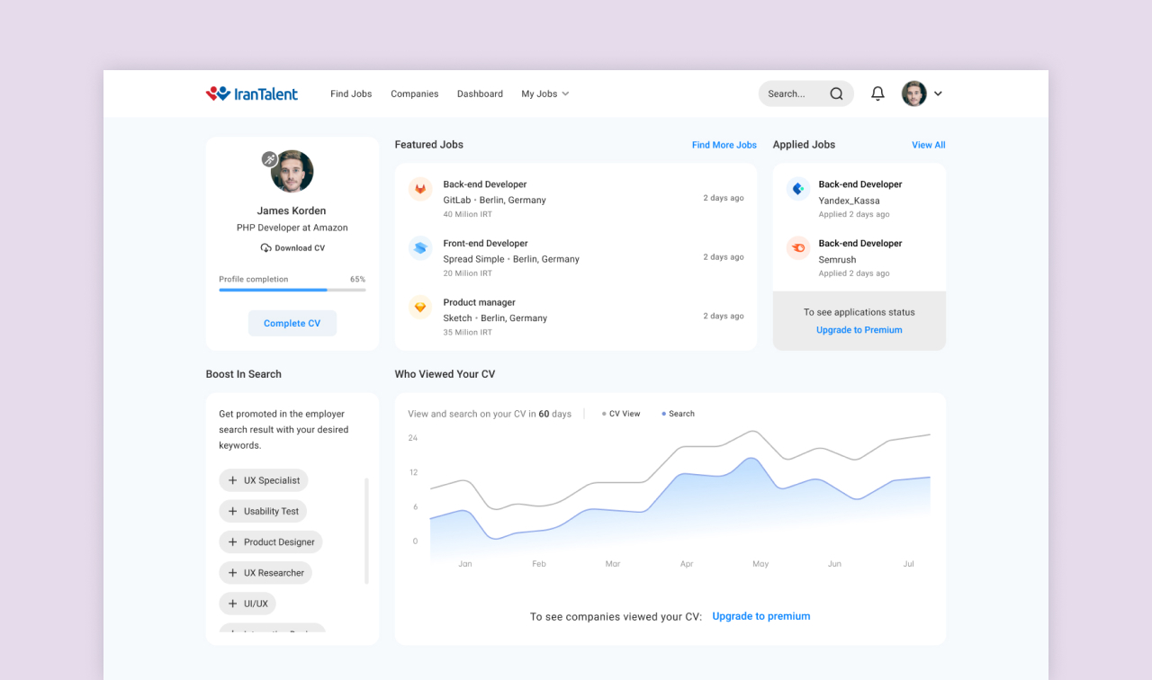
IranTalent.com is the leading job site and SaaS product. Premium accounts offer job seekers advanced tools to get hired faster.
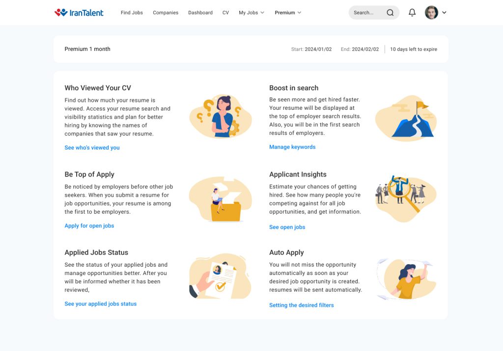
Main problem: Premium user dashboard was complicated and users need some new features. Also we should increase number of sales.
We achieve success by
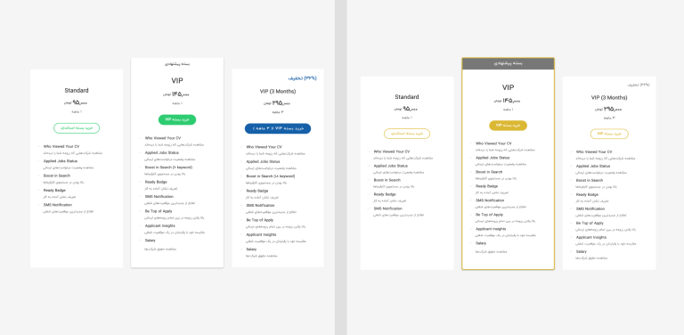
- Improvement on premium package page and subscription flow
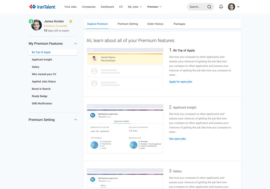
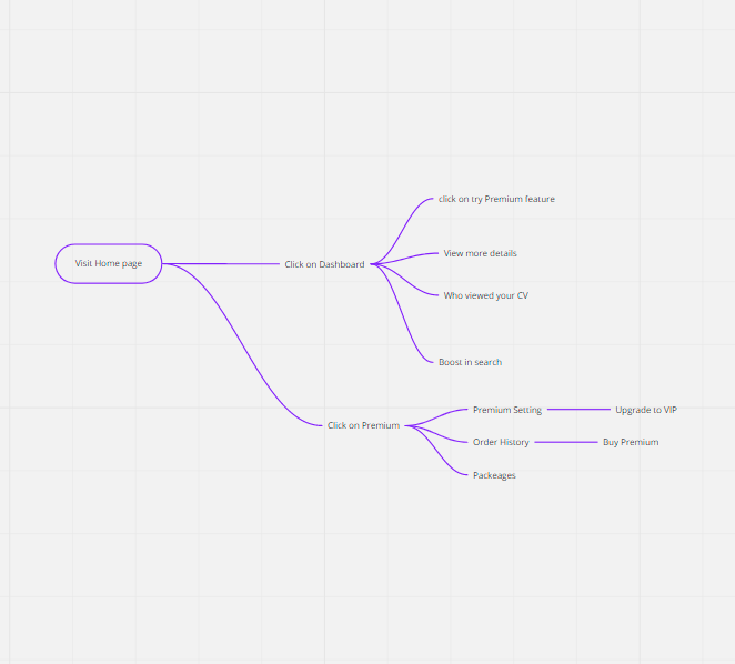
- Streamline the premium dashboard and setting
- Add more funnel for conversion
- Add new features
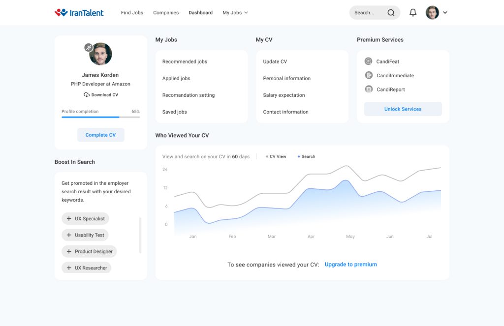
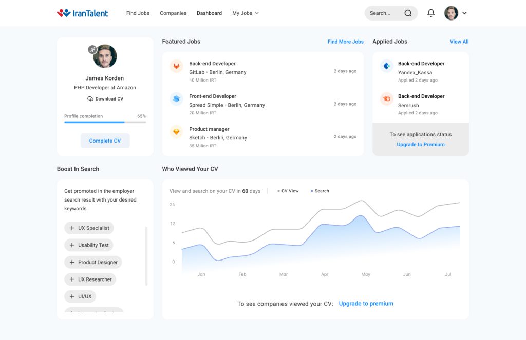
- Enhancements to the candidate main dashboard
Role
User research
User experience design
User interface design
Tools
Figma, FigJam, Hotjar, Skype
Team
- 1 UX Designer(me)
- 1 Product Manager
- 2 Backend Developer
- 1 Front End Developer
Business requirements
After I talked with stakeholders, I identified following business requirements. The data were confidential because I used X and Y.
- Increase conversion rate from X to Y
- Increase retention rate from X to Y
- Add new premium features
- Increase NPS from X to Y
Research insights
- Simple and user friendly premium dashboard
- A simplified process for subscription
- New premium features to increase the chances of hiring
- Improvement on mobile view
- More accurate email notification
Research objectives
The level of familiarity and use of premium services
The level of user satisfaction with the service and the effectiveness of the service for the users
People are familiar with each of the features
Reason for purchasing premium service by users
Other services that users need
Interview questions
How familiar are you with our premium services, and how do you regularly use them in your job search?
On a scale of 1 to 10, how satisfied are you with our premium services? Can you share specific instances where these services have been effective in your job search?
Which premium features are you familiar with and actively use? Are there any features that you find particularly helpful or challenging?
What motivated you to invest in our premium services, and have you experienced any unexpected positive outcomes?
Beyond current premium services, are there specific tools or features you wish were available to enhance your job search experience?
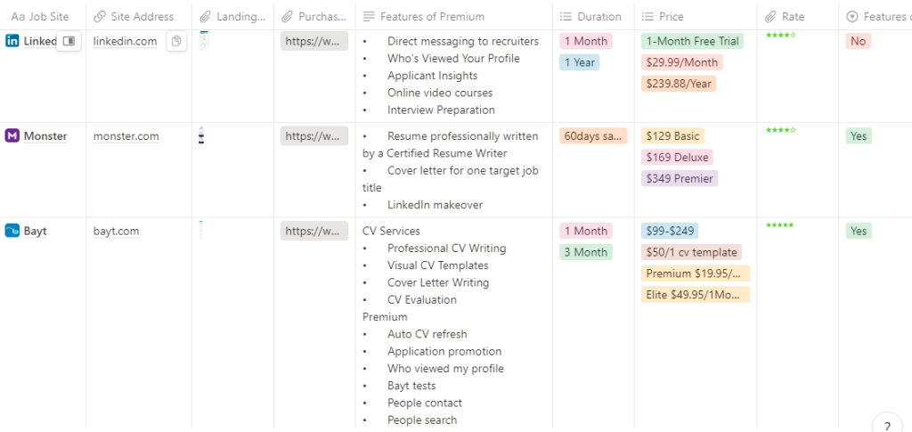
Competitors approach
Required list
- See how you compare to other applicants
- Be Top of Apply
- New package page
- Improvement on premium dashboard and subscription flow
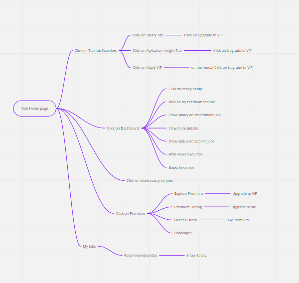
- Funnel at job search and candidate dashboard for premium package page
Solutions I explored
We had different iterations, and in each iteration, we made specific improvements.
Wizard flow
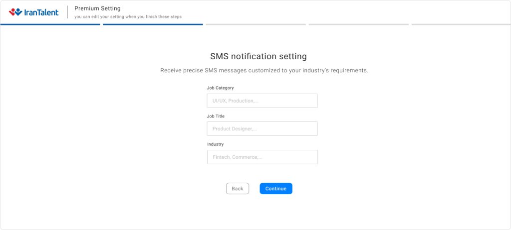
To have more accurate services, such as SMS notifications or appearing in employer searches with specific keywords, users should configure premium settings. However, after subscription, many users tend to forget to do so. Therefore, I attempted to collect this data through the wizard flow immediately after subscription. Users have the option to adjust their settings in the premium settings section too.
This change increased employer and candidate satisfaction.
Subscription flow
The subscription flow encountered a bounce rate, leading to user exits from the dashboard flow. In response, I developed a modal design specifically for the subscription flow.
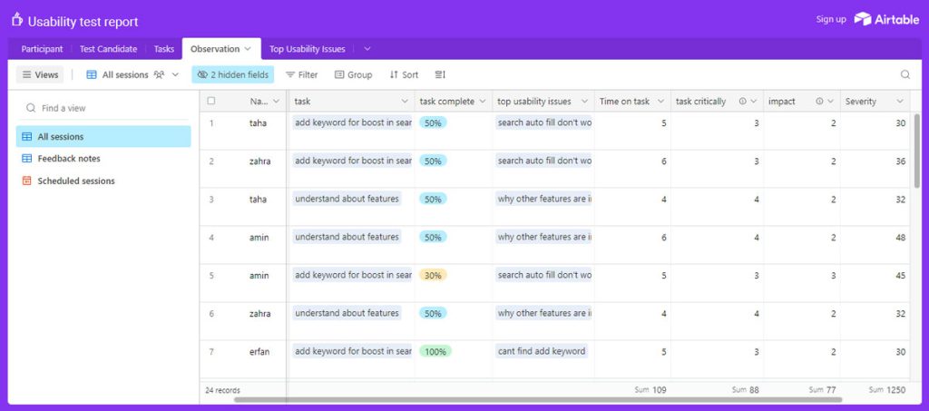
Check usability issues
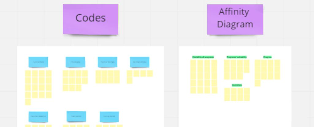
User testing and session recordings were regularly run to observe organic user behaviors, check the health of the experience, and qualitatively test against hypotheses.
Goals
- To examine the usability of the new premium features in the perspective of job seekers
- To evaluate effectiveness of content presentation
- To evaluate user feeling before premium and after premium
- Focus on: Success rates ,Task time ,Error rates ,Satisfaction questionnaire ratings
- Evaluate Information Architecture
Questions
Screening questions- How old are you?
- What’s your income level?
- When was the last time you used the website and Premium Features?
- How much time do you spend on the website?
- How useful Premium’s service has been to you?
- What do you use the Premium features? How often?
- Which features do you use most?
- How satisfied are you with the available Premium workflows?
- What other websites did you use or research before choosing this website?
- Why did you choose this website?
- What’s the first thing you do? Is there another way to complete this task?
- Can users understand how this feature can help them? what advantages and added values they can get by taking the Premium?
- What parts of the Premium Features do you use the most? Why?
- What parts of the Premium Features do you use the least? Why?
- Do you like the interface? Is it easy to use?
- What do you think about how information and features are laid out?
- What do you think of Premium features? How easy is it to find?
- Overall, what’s your experience been with the Premium Features?
- If you could change one thing about the Premium Features, what would it be? Why?
- What one thing are you most excited about with the Premium? Why?
- Why will you continue to use this Features? What will stop you from using this features in the future?
- How likely are you to refer Premium Features? Why or why not?(NPS)
Participant details
4 person with user type “premium new” and “premium retention” with age 24-33 and with activity silver and bronze and Gold and VIP Usability Testing Team- One facilitator – observe users’ behaviors and identify issues.
- One moderator – To guide and support participants, explain the procedure of usability testing.
Evaluation and analyze
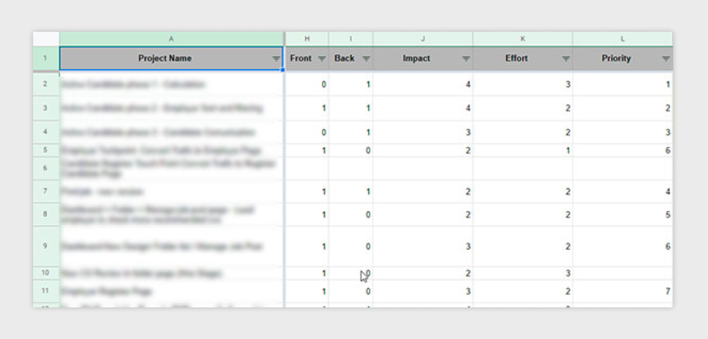
Impact Score for each issue by assigning a value (same as above) for items in this scale:- 5: (blocker) the issue prevents the user from accomplishing the task
- 3: (major) it causes frustration and/or delay
- 2: (minor) it has a minor effect on task performance
- 1: (suggestion) it’s a suggestion from the participant
- Small number: Less important
- Big number: Very important
Report
Solutions I explored
Due to user testing, I identified some issues on the general and premium dashboard and endeavored to resolve them. I prioritized problems we wanted to solve with users.
Result, Increase in:
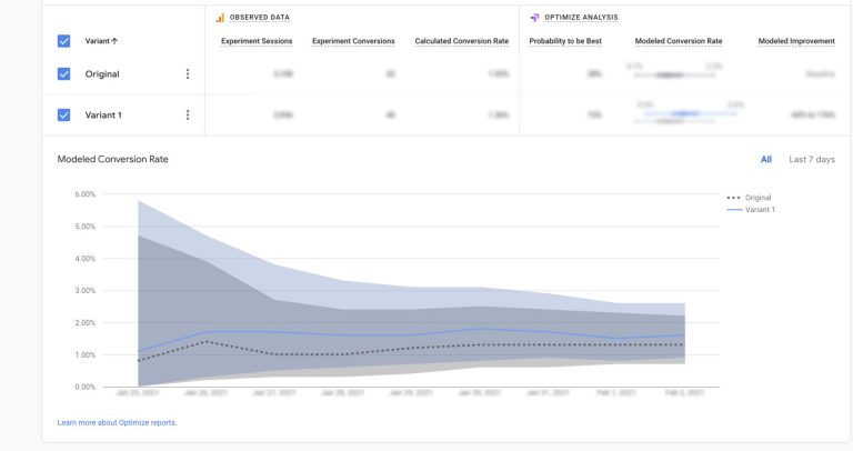
3X
Conversion rate
70%
User satisfaction
30% Retained users
80%
Task completion rate
